Let's investigate the shape of the curve y = a sin t and see what the concept of "amplitude" means. The sine curve occurs naturally when we are examining waves.
Have a play with the following Flash interactive. Run the animation first (click "Start"). Then change the circle radius (which changes the amplitude of the sine curve) using the slider. Then run the animation again.
The scale for this is radians. Remember that π radians is 180°, so in the graph, the value of 3.14 on the t-axis represents 180° and 6.28 is equivalent to 360°.
Did you notice:
- That the shape of the sine curve froms a regular pattern (the curve repeats after the wheel has gone around once)? We say such curves are periodic. The period is the time it takes to go through one cycle and then start over again.
- That in the interactive, when the radius of the circle was 50 units then the curve went up to 50 units and down to -50 units on the y-axis? This quantity of a sine curve is called the amplitude of the graph. This indicates how much energy is involved in the quantity being graphed. Higher amplitude means greater energy.
- That the rotation angle in radians is the same as the time (in seconds, well approximately). See more on radians. All the graphs in this chapter deal with angles in radians. Radians are much more useful in engineering and science than degrees.
Amplitude
The a in the expression y = a sin x represents the amplitude of the graph. It is an indication of how much energy the wave contains.
The amplitude is the distance from the "resting" position (otherwise known as the mean value or average value) of the curve. In the interactive above, the amplitude can be varied from 10 to 100 units.
Amplitude is always a positive quantity. We could write this using absolute value signs. For the curves y = a sin x,
amplitude = |a|
Graph of Sine x - with varying amplitudes
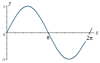
We start with y = sin x.
It has amplitude = 1 and period = 2π.
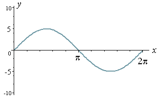
Now let's look at the graph of y = 5 sin x.
This time we have amplitude = 5 and period = 2π. (I have used a different scale on the y-axis.)
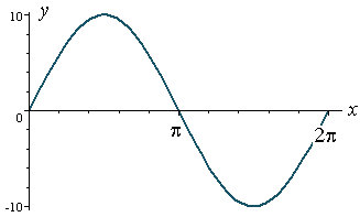
And now for y = 10 sin x.
Amplitude = 10 and period = 2π.
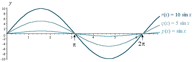
For comparison, and using the same y-axis scale, here are the graphs of p(x) = sin x, q(x) = 5 sin x and r(x) = 10 sin x on the one set of axes.
Note that the graphs have the same period (which is 2π) but different amplitude.
Sine Graph Java Applet
Here's another trigonometric graph interactive to play with. In this Java applet, you can vary the amplitude by using the slider at the bottom. You can also change the function to whatever you like. Try changing it to a*cos(x) and see that the amplitude changes as the value of a changes.
You can also see the effect of a negative in front of the a value.
Graph of Cosine x - with varying amplitudes
Now let's see what the graph of y = a cos x looks like.
Similar to the sine interactive at the top of the page, you can change the amplitude using the slider.
Did you notice?
- That the sine and cosine graphs are almost identical, except the cosine curve is shifted to the left by π/2 (= 1.57 = 90°)?
Now let's have a look at the graph of y = cos x.
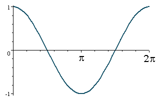
We note that the amplitude = 1 and period = 2π.
Similar to what we did with y = sin x above, we now see the graphs of
- p(x) = cos x
- q(x) = 5 cos x
- r(x) = 10 cos x
on one set of axes, for comparison:
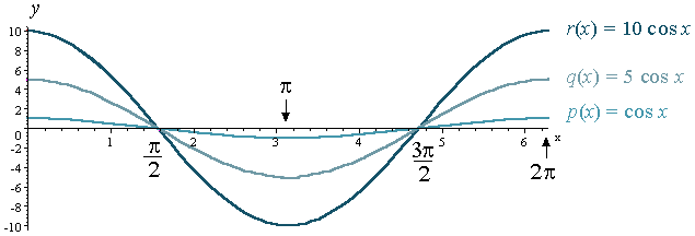
Note: For the cosine curve, just like the sine curve, the period of each graph is the same (2π), but the amplitude has changed.
Exercises
Need Graph Paper?

Sketch one cycle of the following without using a table of values! (The important thing is to know the shape of these graphs - not that you can join dots!)
Each one has period 2π. We learn more about period in the next section Graphs of y = a sin bx.
The examples use t as the independent variable. In electronics, the variable is most often t.
1) i = sin t
2) v = cos t
3) i = 3 sin t
4) E = -4 cos t
source:intmath.com/trigonometric-graphs/1-graphs-sine-cosine-amplitude.php
0 comments:
Post a Comment